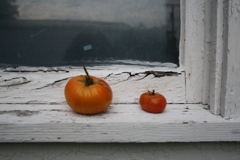
One of the most important rules of composition in photography is the “rule of thirds.”
To put it simply, the photographer must divide the photo into three equal sections (horizontally and vertically) to create 9 equal boxes in the frame. This can be done by changing the settings to view a grid on the camera screen or simply by picturing it when looking through the lens.
Once you have this grid in sight or in mind, place the subject of your photo at an intersection of two lines or parallel to one of the lines.
Example:

I drew this grid over one of my photos quickly, so the measurements are not exact, but it explains the process.
Having my subject and her footprints near the right line and right intersections of the grid gives the photo a more interesting and unique look. It also gives room for more background imagery, in this case the ocean and sand, on the left side of the photo.
Both of these characteristics keep the photo from boring the viewer.
Though one might think the viewer looks directly to the center when first seeing a photo, this is incorrect. Studies have shown that viewers are more likely to look toward the areas of the photo where the line intersections occur.
Here are a few more examples of the rule of thirds.
Here are a few examples of boring photos without using the rule of thirds.
Although these are both boring subjects, they could have been used to create a more unique photo by using the rule of thirds and changing the perspective.
The rule of thirds does not always have to be used to create an awesome photo.
Here is an example of an interesting photo without using the rule of thirds.
This photo is filled with different colors and objects and shows different depths. Although it could be altered to be presented better, it is still a fun photo.
The trick to the rule of thirds is to learn how and when to use it, so you can then learn how and when not to use it.


